In 2023 --the 45th anniversary of China’s reform and opening-up and the 30th anniversary of the founding of Longgang District, Longgang District, to better tell the story of China, the story of Greater Bay Area, and the story of Shenzhen, and to show vividly its image as a city for merit life, officially releases its new logo.
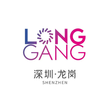
The new logo is designed by Han Zhanning, a famous Chinese designer. It mainly consists of two parts: capitalized Chinese Pinyin of Longgang District (LONGGANG), and Chinese characters of Longgang District, Shenzhen (深圳·龙岗), including foreign and Chinese factors, which indicates the heritage of Chinese traditional civilization and the opening to the outside world. The whole logo is in a totally-new font and highlights the letter “O” in the word “Longgang”.
The “O”, in special design, can stand for “gathering”, meaning that Longgang District is a center of multiple resources; can stand for the crystal-like image of Shenzhen Universiade Center and the red lantern in Hehu New Residence, indicating the root, development and vitality of Longgang District; can stand for “original” and “open”, suggesting Longgang District’s increasing global influence in the fields of emerging industry and scientific innovation and Longgang District’s inclusiveness of new ideas, inspiration and dream; can stand for “oasis” and “optimism”, showing that Longgang District is a pleasant place for living.
The letter “O” can be shown in different forms. It means that Longgang District, in its way forward, keeps pace with the time, being young and colorful.